Your Brand Looks Like Everyone Else’s. Here’s Why That Keeps Happening
There’s a specific kind of frustration that hits when you’ve spent hours on your brand and it still feels… off. Not bad exactly. Just forgettable. Like something you’ve seen before but can’t quite place.
Most people assume this is a budget problem. Like if they could just afford a better designer or fancier tools, it would click. But that’s rarely what’s actually going on.
The real issue is almost always earlier in the process than people think.
Brand Consistency Isn’t About Looking Good. It’s About Looking the Same.
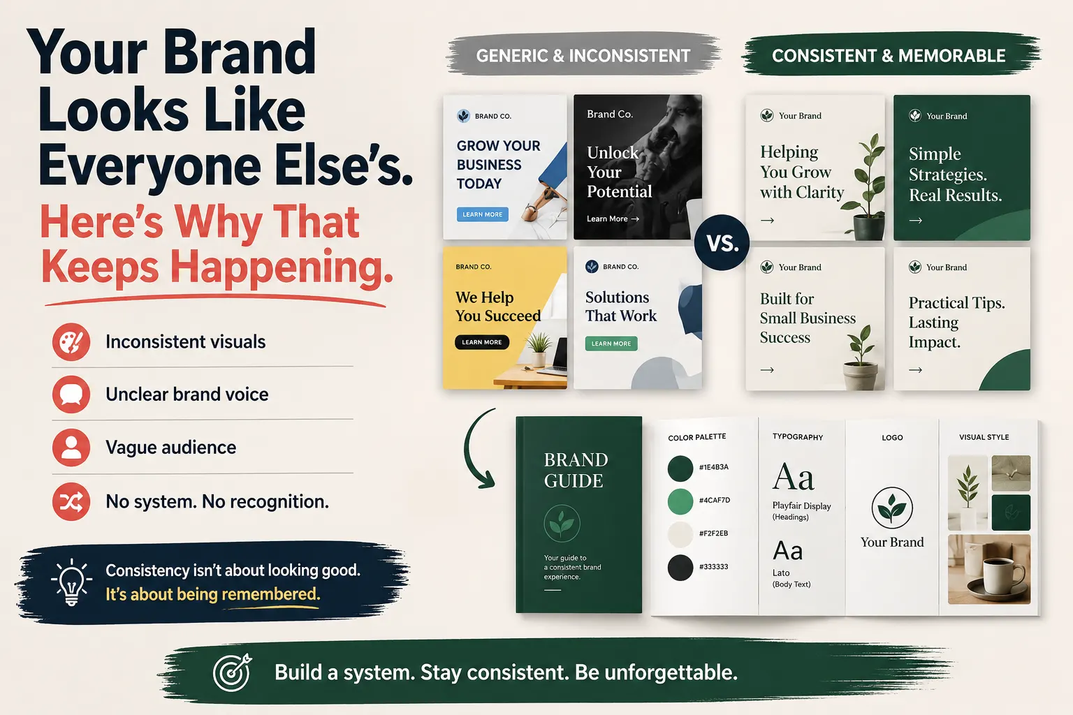
Here’s something that doesn’t get said enough: people don’t recognize brands because they’re beautiful. They recognize them because they’re repetitive.
Think about any brand you immediately trust when you see it. Odds are, it’s not that their design is stunning. It’s that every single time you see them, they look identical. Same colors. Same font. Same general vibe. Over and over.
That repetition is what creates familiarity. And familiarity is what creates trust.
The brands that feel generic aren’t usually the ones with bad logos. They’re the ones that look slightly different every week. Different shades, different fonts, slightly different layout. It adds up fast and people stop noticing you.
The Visual System Problem Most Solo Founders Ignore
When a company hires a designer or agency, one of the first things that gets built is a visual system. Not just a logo, but a set of rules. Use this blue, not that blue. Use this font for headlines. Keep this much space around the logo. Always use photos with this kind of lighting.
Without those rules written down somewhere, you end up making tiny decisions every time you create something. And those small inconsistencies pile up.
The good news is you don’t need an agency to build a visual system. You can set one up yourself in an afternoon. A one-page brand guide with your hex codes, font names, and a few sample layouts is enough to keep everything consistent going forward.
If you’re curious about how to actually set that up without spending anything, there’s a full breakdown of the free tools and steps involved in this guide to building a brand with automated branding tools. It covers everything from logo generation to scheduling content with the same visual identity each time.
Why Your Brand Sounds Like Someone Else Too
Visual consistency is only half the problem. The other half is voice, and most people never think about it seriously.
Your brand voice is how you write. The words you choose. The length of your sentences. Whether you say “reach out” or “get in touch.” Whether you’re formal or casual. Whether you explain things simply or use industry language.
Most small brands have no defined voice. So whoever is writing that week writes in their own natural style. And it drifts.
If you have a team, this is even worse. Three different people, three different styles, all posting under the same brand.
The fix is easier than it sounds. Write down a few sentences that describe how your brand talks. Not vague things like “friendly and professional” (everyone says that). Specific things like: “We explain things like we’re talking to a smart friend, not a client. We use short sentences. We avoid formal sign-offs like ‘Best regards.'”
Once you have that, you can use it as a prompt in AI writing tools and suddenly everything starts sounding like it came from the same place.
The Part Most People Rush: Actually Knowing Who You’re Talking To
This is where a lot of brand problems begin, not in the execution but in the setup.
People get excited about logos and colors and skip the harder question: who is this for, specifically?
Not “small business owners.” That’s too vague. “Freelance designers who are scaling to an agency and starting to hire” is a real audience. “Moms running side businesses from home who have under an hour a day to market themselves” is a real audience.
The more specific you get, the easier every other decision becomes. Your colors, your tone, your content ideas, all of it flows from having a clear person in your head that you’re making things for.
If your brand feels generic, there’s a decent chance you’ve been unconsciously designing for everyone. And designing for everyone means connecting with no one.
What Actually Changes When You Fix These Things
This isn’t about perfection. A brand doesn’t need to be flawless to work.
What it needs is: enough consistency that people start to recognize you, enough clarity that the right people immediately feel like it’s for them, and enough repetition that trust has time to build.
That’s achievable without a budget. It’s achievable alone. It just requires being intentional about the basics before you start producing content.
Most people reverse the process. They start posting and then wonder why nothing is sticking. Getting the foundation right first, even if it takes one focused weekend, changes the whole trajectory.
Your brand doesn’t look like everyone else’s because you lack talent or money. It looks that way because the system behind it is missing. Build the system first. Then let it run.
If you’re ready to put these ideas into practice, follow this step-by-step automated branding guide to build a consistent visual identity, automate content creation, and keep your brand looking professional from day one.